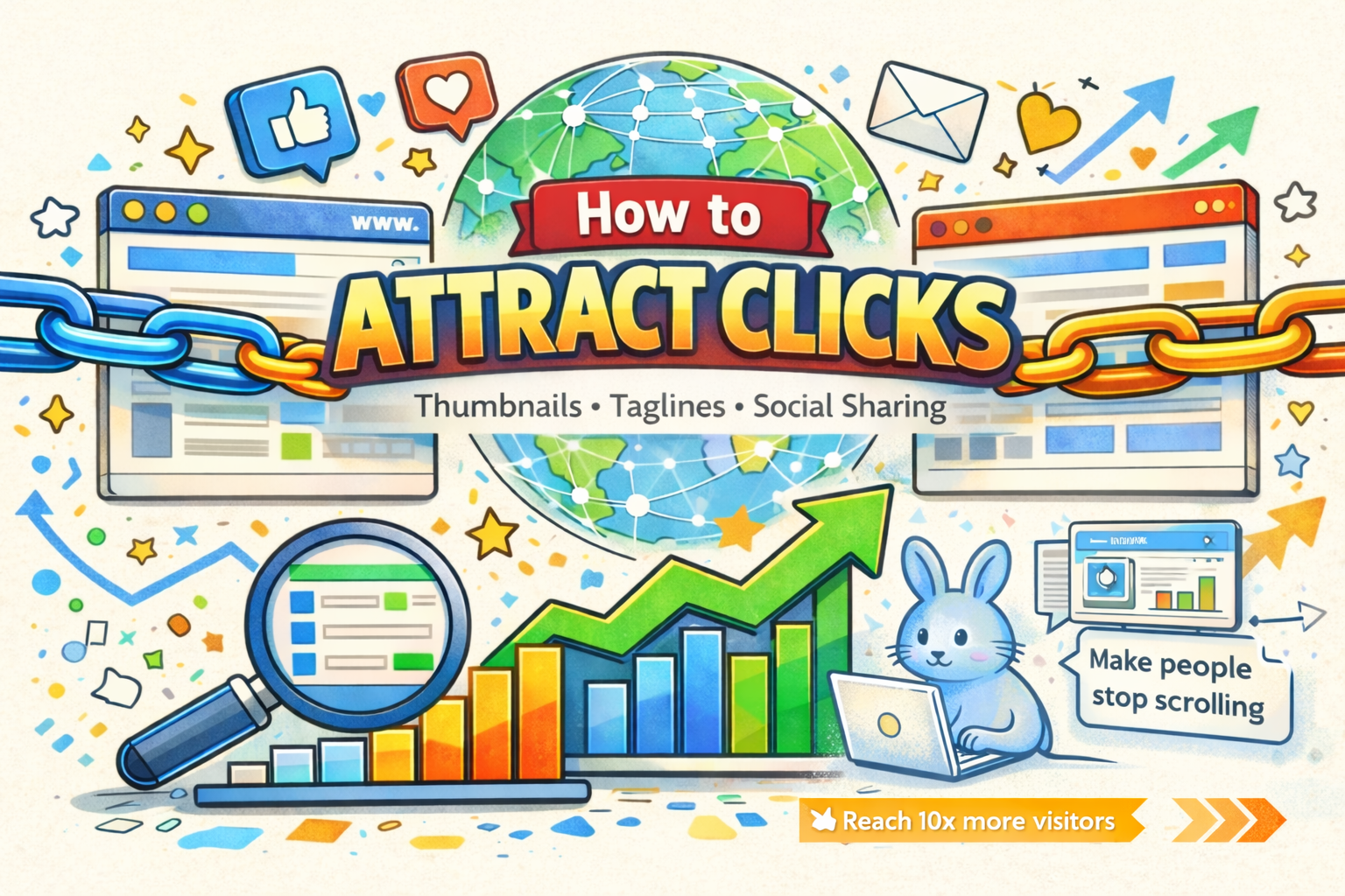
How to Make People Actually Click on Your Startup
How to Make People Actually Click on Your Startup
You launched your product.
It's live on directories. It's posted on Twitter. It's sitting on your profile.
But nobody clicks.
The product works great. The landing page looks clean. Yet somehow, people scroll right past it.
The problem isn't your product. It's your packaging.
In a world where people make click-or-skip decisions in under 2 seconds, how your product looks from the outside matters just as much as what it does on the inside.
Let's fix the three things that actually make people click:
Thumbnails, Taglines, and Social Sharing.
Thumbnails That Stop the Scroll
Why Thumbnails Matter More Than You Think
Your thumbnail is your product's first impression.
On directories like Launchit, on social media feeds, and even on Google search results, the thumbnail is what people see before they read a single word.
**A bad thumbnail = invisible product.
A great thumbnail = curiosity + clicks.**
Think about YouTube.
The most watched videos don't always have the best content. They have the best thumbnails.
The same principle applies to your startup.
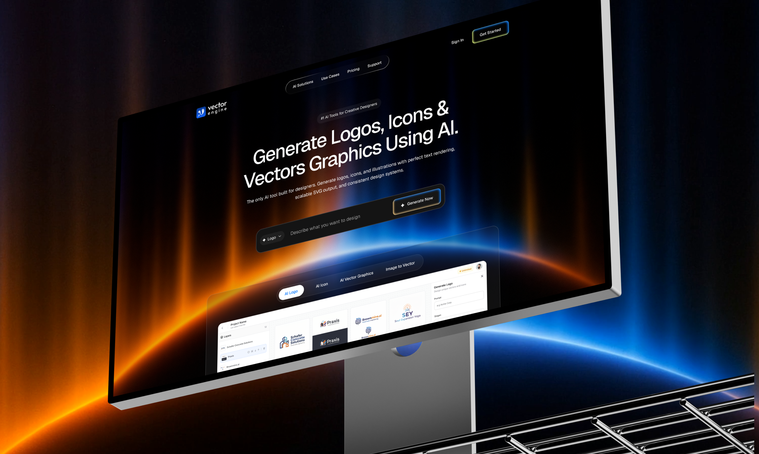
The Anatomy of a Great Product Thumbnail
Show the product, not a logo
Nobody clicks on a plain logo.
People click on something that looks useful and interesting.
Instead of showing just your logo, show:
• A screenshot of your product in action
• The UI with real data
• A before and after comparison
• The result your product creates
Your product interface is often your best marketing asset.
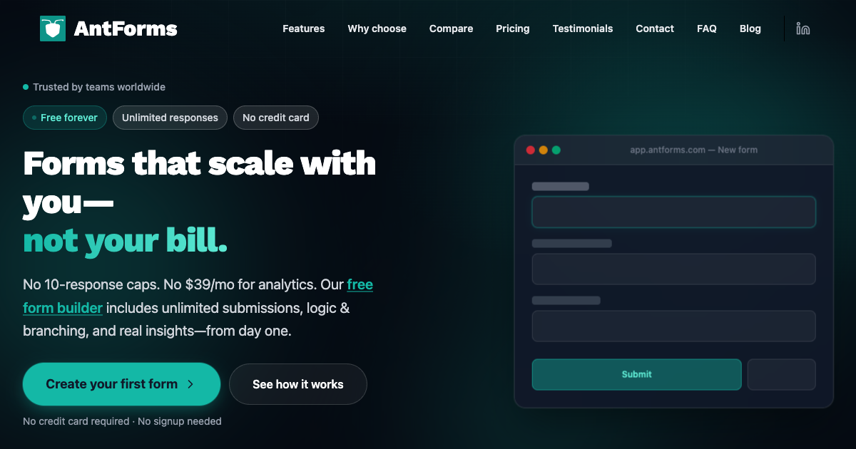
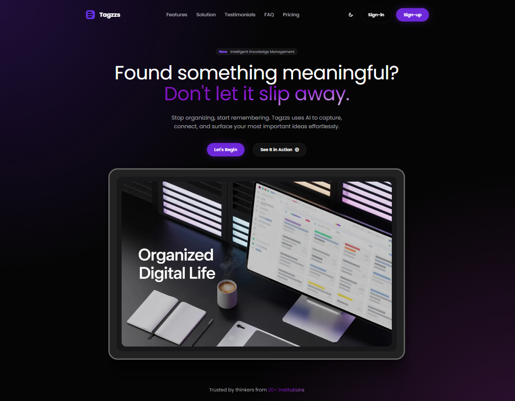
Use contrast and bold colors
Your thumbnail needs to stand out in feeds that are usually white or dark.
What works well:
• Bold gradients
• Dark backgrounds with bright UI elements
• Strong contrast between text and background
• Vibrant accent colors
What usually fails:
• All white screenshots on white backgrounds
• Washed out color palettes
• Too many colors competing
• Tiny unreadable text
Keep it clean with one focal point
Your thumbnail should communicate one idea instantly.
Not five features.
Not a collage of screenshots.
Not your entire dashboard.
Just one clear visual that makes someone think:
"That looks interesting. Let me click."
Add subtle text overlays
If your UI isn't instantly obvious, a small overlay helps.
Examples:
AI Resume Builder
Track expenses in 10 seconds
Free & Open Source
Keep overlays under five words.
If your thumbnail needs a paragraph to explain itself, it’s too complex.
Thumbnail Mistakes That Kill Clicks
Avoid these common mistakes:
• Generic stock photos
• Just a logo
• Blurry or low resolution images
• Too much happening in one image
• Dark text on dark backgrounds
If people can't understand the thumbnail instantly, they simply scroll past it.
Tools for Creating Great Thumbnails
Here are some simple tools founders use:
Figma – best for custom designs
Canva – fast templates for non designers
Screenshots + annotations – sometimes your UI is enough
Shots.so – beautiful device mockups
OG image generators – automatic social preview images
Taglines That Hook
The 2 Second Rule
People read your tagline in about two seconds.
In that moment they decide:
• This is for me → click
• I don't get it → scroll
• This is generic → ignore
Your tagline only has one job:
Make the right person curious enough to click.
Formula 1: Problem → Solution
Structure:
Action without pain
Examples:
Build landing pages without writing code
Track expenses without spreadsheets
Get user feedback without annoying surveys
This works because it highlights the pain you remove.
Formula 2: Simple Description
Structure:
What it does for who
Examples:
Invoice automation for freelancers
AI writing assistant for developers
Project management for solo founders
Clarity beats cleverness.
Formula 3: Outcome Focused
Structure:
Result in time or effort
Examples:
Ship your SaaS in a weekend
Get 10x more leads from your blog
Launch your startup in under five minutes
People care more about results than features.
Formula 4: Comparison
Structure:
Product equals known tool for niche
Examples:
Notion for developers
Canva for presentations
Stripe for creator payments
This instantly helps people understand your category.
Use it carefully so it doesn't feel derivative.
Tagline Mistakes That Kill Interest
Avoid these:
Too vague
The future of productivity
Too long
An AI powered collaborative document editing and project management platform
Too clever
Where ideas meet pixels in the cloud
Too technical
gRPC based microservices orchestration layer
Too generic
The best tool for your business
If people can't understand your product instantly, they move on.
The Tagline Test
Show your tagline to someone who has never heard of your product.
Ask them:
What does this product do
Who is it for
If they can't answer both correctly, rewrite the tagline.
Social Media Launch Posts That Get Engagement
Most founders launch like this:
I just launched my product. Check it out.
This gets almost zero engagement.
Why?
• No story
• No emotion
• No context
• No reason to click
People share stories, not product announcements.
The Twitter Thread Formula
A simple structure that works well.
Tweet 1 – Hook
Start with a surprising or personal story.
Example:
I spent six months building a product nobody used. Zero signups. Zero revenue. Then I changed one thing and everything flipped.
Tweet 2 to 4 – Story
Explain the struggle and what you learned.
Tweet 5 – Product reveal
Introduce your product naturally.
I built ProductName — a simple tool that helps founders do X.
Tweet 6 – Social proof
Share early traction or user feedback.
Example:
First week results
50 signups
12 paying users
and this message from a user
Tweet 7 – Call to action
Try it here: link
I'd love your feedback.
Threads like this often get 10–50x more engagement.
LinkedIn Launch Posts
LinkedIn prefers professional storytelling.
A good structure:
Example hook:
Most freelancers spend five hours per week on invoicing. That is 260 hours per year. I wanted to fix that.
Reddit Launch Posts
Reddit dislikes obvious marketing.
Instead focus on value and transparency.
Share:
• Your story
• What worked
• What failed
• Real numbers
Put the product link naturally at the end.
Good subreddits:
r/SideProject
r/startups
r/Entrepreneur
r/indiehackers
Indie Hackers Launch Posts
The Indie Hackers community loves:
• Real metrics
• Honest lessons
• Technical details
• Growth experiments
A good format:
I launched ProductName and got X users in X days. Here's exactly what I did.
Then break down each channel and result.
The Launch Sharing Checklist
Day One
Launch on the core platforms.
Launchit
Product Hunt
Twitter thread
LinkedIn post
Day Two to Three
Share in communities.
Reddit
Indie Hackers
Hacker News
Slack or Discord groups
Day Four to Seven
Extend your reach.
Facebook groups
Dev.to or Hashnode
YouTube demo video
Instagram stories or reels
Week Two
Create follow up content.
Launch recap blog post
Twitter learnings thread
Email newsletter
Community updates
Ongoing Promotion
Keep the momentum going.
Building in public updates
User testimonials
Feature announcements
Milestone posts
The Psychology of Clicks
Understanding why people click helps you design better thumbnails and posts.
Curiosity Gap
People click when they feel a gap between what they know and what they want to know.
Example:
I built a SaaS making $5K per month with zero marketing. Here's how.
People click because they want the missing information.
Social Proof
People trust what others already trust.
Example:
Used by 500+ founders
If many people use it, others want to check it too.
Urgency
Give people a reason to act now.
Example:
First 50 users get lifetime access.
Without urgency, people say I'll check later, which usually means never.
Identity
People click on things that feel like they are made for them.
For indie hackers
For freelancers
For designers
Specific audiences convert better than "for everyone."
Key Takeaways
Your thumbnail decides the click.
Make it bold, clear, and product focused.
Your tagline has two seconds.
Clarity beats cleverness.
Stories outperform announcements.
Tell the journey behind the product.
Share your launch everywhere.
Directories, social media, and communities.
Understand click psychology.
Curiosity, social proof, urgency, and identity drive attention.
Packaging matters as much as the product.
The best product in the world still fails if nobody clicks.
Ready to launch your product?
Submit it on Launchit and showcase it to a community of builders actively looking for new tools.
https://www.launchit.site/submit
Projects Launched on Launchit
Real projects earning backlinks and building visibility.
Ready to launch your project?
Get dofollow backlinks, SEO visibility, and reach builders actively looking for products like yours.
Launch on Launchit